
Moderation api changelog
The New Review Queue
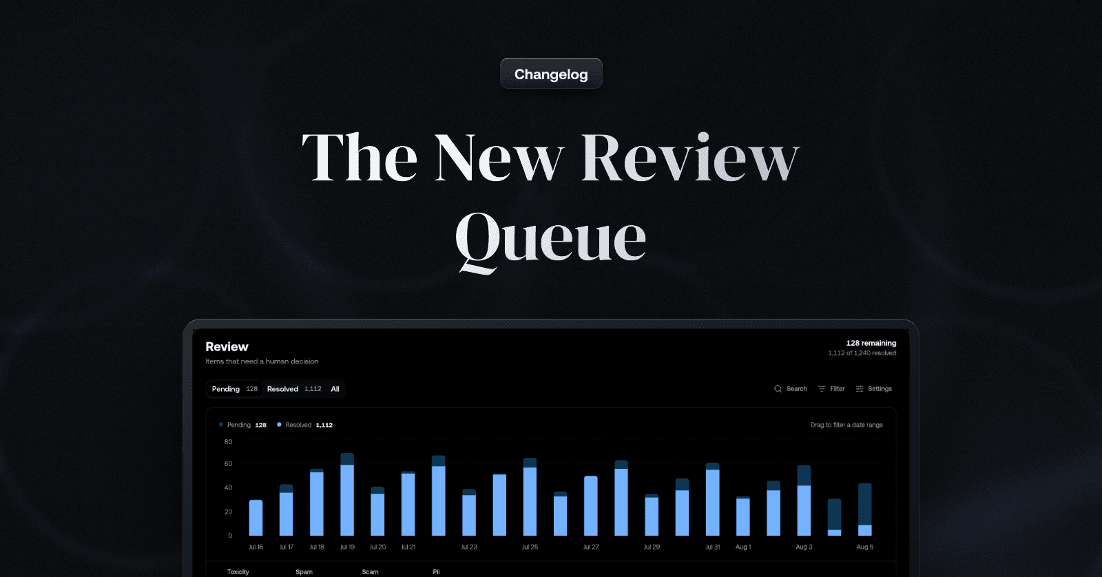
One inbox, filters you can see and save, and views shaped to how your team works
Review queues grew a lot of configuration over the past year, and many of you told us
the same thing: getting from "I opened the dashboard" to "I'm making decisions" took too many steps. Several sibling queues, a filter dialog, a chart before the content - the work was buried under its own tooling.
We've spent the past weeks rebuilding the whole surface around one question: how quickly can a moderator find the items that need them, decide, and move on?
Start in one place
New projects start with a single Review inbox: every item the system asked a human
to look at, across all channels. You no longer have to check several queues to be sure
nothing slipped through - and the sidebar shows how many items are waiting, so you know the size of the day before you click. Resolving an item in the inbox resolves it
everywhere.
Always know what you're looking at
The filter dialog is gone. Filters now live in a filter bar on every queue: each
active filter is a visible chip, so the question "why am I seeing these items?" always
has an answer at the top of the page. Adjust a chip and the table follows; when your
filters differ from the view's saved definition, the bar tells you - keep the change for
yourself, or save it as the new default for your whole team.
Get to the items that matter in seconds
Narrowing thousands of pending items down to the ones that need you is now a sentence, not a setup task: with AI filters.
Describe what you want to review in plain language: "flagged video from new accounts this week" - and the AI builds the filter for you, ready to refine like any other. New properties close gaps you've asked for:
Text search — when a user reports a message, find it by typing what you remember
of it. Each search term becomes a chip, and adding more terms narrows further.Media type — review text, images, video, and audio separately when they need
different judgement.Author trust level — put reviewer attention on content from the accounts most
likely to need it.Content ID — pull up every moderation request for one piece of content when a
user reports it or a decision is appealed.Date, by dragging — drag across the activity chart to zoom the queue into a date
range, so investigating a spike starts where you saw it.
Views shaped to each team
Any slice of the inbox can be saved as a view and shared: a fraud team's view can
lead with author and metadata columns, a marketplace team's with specific channels and labels. Each view chooses its own columns, built-in fields plus any metadata keys found on your items, and every row always carries its channel and author, so the common case needs no configuration at all.
Views make an investigation reusable: once you've narrowed down to a pattern worth watching, save it, and your teammates start tomorrow from the same place.
Decisions up front - and undoable
Queue pages now lead with the content: Pending / Resolved / All tabs, remaining and
resolved totals, and the table right below. Bulk actions, keyboard shortcuts, and item detail all work as before, with one addition: selecting already-resolved items flips
the action bar to Unresolve, so a batch resolved too eagerly comes back in one step.
Existing projects keep their queues exactly as configured. Every queue you already have picks up the filter bar, tabs, and new filters automatically. The single Review inbox applies to new projects.
If your project has accumulated queues over time, this is a good moment to tidy up:
most setups get simpler as one inbox for daily review plus a handful of saved views for routing and auditing. And if you're unsure how to map your current queues onto views, or want a second opinion on your review workflow, reach out through support and we'll gladly help you set it up.